Core Matching Principle
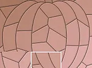
At its heart, this puzzle asks players to identify tiles that share a common visual trait. The two key attributes are color shade and line pattern. A tile might have a light blue background, while another has a slightly darker blue. Or a tile might feature thin vertical lines, while another has thick horizontal stripes. The challenge lies in noticing these subtle differences and grouping the right pairs together. This simple rule creates a surprisingly engaging experience that trains the eye to see details often overlooked.
Uncovering Hidden Artwork
Each completed puzzle reveals a hidden shape beneath the tile board. This feature adds a layer of discovery to the matching process. As you clear tiles, parts of the image appear, giving you a small reward for each correct pair. The hidden images are gentle and family-friendly, often depicting simple objects or scenes. This mechanic turns each level into a mini-revelation, encouraging players to finish the board just to see what lies below.
Controls and Accessibility
The game is designed to be played on both touchscreens and desktop computers. On a phone or tablet, you tap or drag a tile to select it, then tap another tile to attempt a match. On a computer, you click with a mouse. Visual hints are available if you get stuck, but the game never forces you to use them. There are no complex menus or instructions, making it easy for anyone to start playing immediately. A full-screen mode is also available for a more focused experience.
Pacing and Difficulty Curve
This game deliberately avoids time pressure. There are no countdown timers, no score multipliers for speed, and no penalties for taking a long time. Early levels present obvious color or pattern differences, while later puzzles introduce more nuanced variations. The difficulty increases gradually, ensuring that players of all skill levels can find a comfortable challenge. The lack of urgency makes it an ideal choice for unwinding after a busy day.
Visual and Audio Atmosphere
The visual style is clean and uncluttered, with tiles that are easy to distinguish. Colors are soft and calming, avoiding harsh contrasts. Sound effects, if present, are subtle and non-intrusive, designed to enhance rather than distract. The overall aesthetic supports the game's goal of providing a peaceful mental break. Everything from the tile design to the background color is chosen to reduce eye strain and promote relaxation.










Comments
0 comments